Pages

Sunday, August 26, 2012

I.S.T.Y.O - A brief exploration of the project part 3

This months cover,
photo by K.K.W
From Bauhaus to "The International Style" : New Architecture in NYC & Skopje.
By K.K.W


In 2006, Hugh Pearlman, the architectural critic of The Times, observed that those using the style ("The International Style") today are simply "another species of revivalist", noting the irony. (1)  He certainly has a point, though as with everything, its the beginnings of the thing, its growth/change, through time and its influence long after its beginning. 

If you asked me now I would have to be honest; most of the new architecture in NYC (Brooklyn & Manhattan), I noticed it, although I did not see it
Meaning it didn't click and start a chain reaction of creativity. As of now, its all I see.
The extensive use of glass, the simplicity in design, the lack of ornamentation and their often stark contrast to the other buildings that seem from bygone eras, whose meaning has not yet been forgotten, though its quickly fading.


Bauhaus University, Weimar Germany 1911
Image courtesy of Wikipedia
Most if not all the new architecture ("The young ones") in New York and Skopje is of the "International Style" (Bauhaus), or features elements of it. This is mainly the absence of ornamentation and by harmony between the function of the building and its design. However, for many of the new buildings it just might be the look, and some fleeting sense of the Bauhaus ideology, which may be a matter of opinion. Simplicity (sometimes radical), low-cost materials, adoption of large amounts of glass (geared towards use of natural light), and depending on the function of the building or structure and how many in the same area - pleasant /disturbing uniformity (cost effective).


Much of what fueled the development of the Bauhaus (International style) is  "Modernism", a cultural movement whose origins lay as far back as the 1880's, and the rise of the industrialized world of the 20th century. These two aspects provided the guideline for most of the creative fields - "make it new!" -Ezra Pound(1). Traditional forms and ways of creating were seen as out-dated and obsolete. A salient characteristic of that time was self-consciousness, leading to experiments with form and work that draws attention to the process and materials used. And the materials to be used: glass, steel/iron, re-inforced concrete and cast-iron were now produced on an even larger scale then before. The forms were beginning to be simplified and geometrically emphasized. The Crystal Palace, Paddington station, Brooklyn Bridge, the Effel Tower, AEG Turbine Factory, The Fagus Factory, The Bauhaus University at Weimar & Dessau.


Bauhaus School, Dessau Germany 1926
Image courtesy of Wikipedia
As society began to drastically change with the onset of the 20th century and the rise of modern urban centers, you had radicals like Walter Groupius who would expound - "...we want architecture adapted to our world of machines, radios and fast cars." (3).  His style of architecture and consumer goods was to be functional, cheap, and consistent with mass production, which worked well in Germany before WWI & WWII, but mostly after WWII, to address the postwar housing crisis and to fulfill the promise of article 155 of the 1919 Weimar Constitution ("..a healthy dwelling.." for all Germans, 4). In the United States,  given the difference in government, economics, and society, much of this would be transfered, although without the municipal-socialist ideology. In socialist Yugoslavia modern architecture would have a strong influence and display its own social and cultural context. " The Brutalist Style", an off-shoot of "The International Style" developed by Le Corbusier would become very popular there. This, especially after the major earthquake that destroyed much of Skopje in 1963. Both Gropius and Marcel Breuer would teach at the Harvard Graduate School of Design, and their collaboration produced "The Aluminum city terrace" in New Kensington Pennsylvania and the Alan I W Frank House in Pittsburgh.  


The Harvard school was enormously influential in America during the 1920's and early 30's producing such greats as Philip Johnson, I.M. Pei, Lawrence Halprin and Paul Rudolph. Philip Johnson would meet Mies van der Rohe (architect-director of the Bauhaus school, 1930-33) in 1928 which was a revelation for him at the time, and would help lead to major influences in American architecture for next 30 years. Both Johnson and Henry Russell Hitchcock along with Alfred H Boar (after touring Europe) would produce the landmark exhibition, "The International Style" : Architecture since 1922 at the Museum Of Modern Art  (1932). The show was a smash, introducing architects like Le Corbusier, Walter Gropius and Mies van der Rohe. It would help to put forth the ideals of the Bauhaus ideologies and heavily influence American, and modern architecture in general. The book accompanying the show, coauthored with Hitchcock , Johnson argued that the modern style maintained three formal principals: 1. an emphasis on architectural volume over mass (planes rather than solidity) 2. a rejection of symmetry, and 3. rejection of applied decoration. Often enough you find that these principals are not always rigidly applied. 


Villa Savoye, France 1928
Image courtesy of Wikipedia
You can see much of this and aspects of the Bauhaus movement in structures like The Villa Savoye - Possiy, France - 1931, the Glass Palace: Heerlen Netherlands - 1935, the Glass House: New Canaan Connecticut - 1949, The "Lever House": NYC -1952, The Seagram Building: NYC -1956, and Kunsthalle: Bielefeld, Germany, 1968. All of theses structures are striking in that they figuratively overshadowed much of the other architecture of their time and contrasted strongly with them, that they became unforgettable.  Also, there was the major influence they ("the young ones" of their day) spurred. The same can be seen with architecture in New York and Skopje, as much of the it both visually and or by design, incorporate so much of the  principals of Bauhaus (The International style). The MRT Center building: Skopje, 1984,  a shopping center in Vero Skopje , a residential building: on the Westside of Manhattan, NYC,  Soravia Center: Skopje,  a residential building: @ The Highline, NYC,  The seat of the European Union: Skopje.

The Engel House, in the white city of
Tel Aviv, 1933.  
Image courtesy of Wikipedia

The Glass palace, Netherlands 1935
Image courtesy of Wikipedia
"The people are the creators and or inhabitants of the city and its structures, moving through and about them like blood cells move through our veins. The one without the other is pointless and more importantly, cannot be. Finding common ground, similarities, exchanging ideas while bringing attention to the disappearing parts of our cities due to change, is the goal of the project. To find some beauty, if any, in the juxtaposition of the "young ones" to their elders." (5). For more info go the project page on Facebook & see articles @ www.studiophoenix.blogspot.com - April 2012 post's.

The MoMa (Museum of Modern art) NYC 1939.
Image courtesy of Wikipedia


The Glass house, New Canaan Connecticut 1949
Image courtesy of Wikipedia 
The Farnsworth house Chicago Illinois, 1951.
Image courtesy of Wikipedia

The Lever House, NYC 1952.
Image courtesy of Wikipedia
The Seagram building, NYC 1956.
Image courtesy of Wikipedia

The Europa Center, Germany (as seen from the Kurfurstendamm)
1965. This building was directly inspired by The Lever House.
Image courtesy of Wikipedia


MRT building 1984, Skopje Macedonia.
Image courtesy of Wikipedia
Sorovia Center, Skopje (recent)
Photo courtesy of Darkkind

Skopje, center of the town, crossroad between Kliment ohridskistreet 
and boulevard PArtizanski odredi.
Photo courtesy of Matej Bogdanovski

Seat of the European Union: Skopje Macedonia
Image courtesy of wikipedia
MoMa (Modern museum of art) NYC
2004. Photo courtesy of Wikipedia

Residential building @ The Highline, west-side
NYC. Photo by K.K.W

Residential buildings, Williamsburg Bklyn NYC.
Photo by K.K.W

Residential buildings, Williamsburg Bklyn NYC.
Photo by K.K.W
Residential buildings, Williamsburg Bklyn NYC.
Photo by K.K.W
If you would like to know more, go to:www.facebook.com/VoSenkataNaMladiteInTheShadowOfTheYoungOnes, or:www.studiophoenix.blogspot.com/2012/04/istyo-brief-exploration-of-project-part.html. "Art is the reason, art is the way." 1: The Wikipedia article Brutalist architecture, 2: Wikipedia article Modernism, 3-4 Wikipedia article Bauhaus, 5: Kerwin Williamson's artist statement for the project "In The Shadow Of The Young Ones". Eastland Freeport Boat Shoes (Google Affiliate Ad)Nunn Bush Macallister Saddle Oxford Shoes (Google Affiliate Ad)Canon T3 12.2MP Digital SLR Camera with 18-55mm f/3.5-5.6 IS II Lens - (Google Affiliate Ad)Nikon Coolpix P510 16.1MP Digital Camera with 42x Optical Zoom - (Google Affiliate Ad)Lenovo IdeaPad A1 Tablet 22282EU (Google Affiliate Ad)Coby Kyros 7" Android OS 4.0 Capacitive Touchscreen Tablet, 512MB (Google Affiliate Ad)

Wednesday, August 15, 2012

@ The Clocktower Gallery

This months cover,
Photo by K.K.W
Artists Open Studios: Emerging artist residency program. Text & photos by K.K.W

The Clocktower Gallery (also home of 'AiR', Art International Radio) has had some amazing exhibitions and events, like "Canyon Candy". In addition to this, their yearly artist open studios, of which 2011 was much better. 

This years "Open Studios" was a mixture of art & science (as it was the last time I was there) merging together by the artists of the Emerging Artist Residency Program. The idea of such a thing is not exactly new and has been increasing over the last 10-15 years, and now is a strong feature in the visual art / music world. Much of the time such science or "sci-fi" art is really interesting and engaging (David Linton - "Bicameral research sound & projection system"), however with the two at the gallery this time, left something to be desired. 

The Ashcan orchestra's "Apollo's Accidental Answer", a radical, non-traditional opera of sound (based on the myth of Cassandra) was not fully ready to debut. The viewers seeing only so much, and hearing what seemed to many an annoying noise coupled with thrown-together aging electronics. One man stormed off saying, "I don't know what this is suppose to be, its just noise". The set-up and lighting seemed interesting enough, as does the idea behind it, although something was missing. The crowd was an even mix of the young, not-so young and the older, many seemed disappointed. 

Matthew Ostrowski: "The Host", is an unending musical work for a carillon of automated telephone bells. "Using computer models based on swarm intelligence amongst organisms such as crickets and fireflies, small-world network algorithms, and Markov chains, The Host is both an environmental installation and a duration-based piece of music." The wording of this installation and the idea behind it is quite good, but the actual installation falls somewhat short of these words. the crux of it was the phones all linked together, ringing in a particular pattern that repeated itself after a certain amount of time. 

The sound they made was not very appealing, and quickly grows to be annoying (the reaction of the audience was quite clear.), while the look of the set-up seemed to simple and without much creative flair. I will admit there was a certain feel, the sense of a Host, something lingering. But that thing had a toned down feel to it that was not enough to bring you face to face with the idea behind it all. Perhaps it was that the execution and set-up needed a bit more for a better effect. 


The Ashcan Orchestra, part of their Opera:
"Apollo's Accidental Answer"


Joe Ahearn Curator of Performance and
installations.


The Ashcan Orchestra 

The Ashcan Orchestra 


Matthew Ostrowski: The Host. His installation was a series
of rotary phones, used to create an unending musical work for a carillon
of automated telephone bells.  

I think the set-up and materials could have been much
better to have an even more dramatic effect.


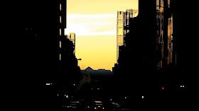
Downtown Manhattan, near to the Bklyn Bridge,
as I was walking with my bike to go across the bridge.
If you would like to know more, go to: www.artonair.org, or:www.studiophoenix.blogspot.com/2011/12/art-science-clocktower-gallery.html, or:www.studiophoenix.blogspot.com/2012/02/now-age.html. "Art is the reason, art is the way." Nikon Coolpix L810 16.1MP Digital Camera with 26x Optical Zoom - (Google Affiliate Ad)Canon T3 12.2MP Digital SLR Camera with 18-55mm f/3.5-5.6 IS II Lens - (Google Affiliate Ad)Nikon D5100 16.2MP Digital SLR Camera with AF-S DX Nikkor 18-55mm f/3. (Google Affiliate Ad)

Laura Vitale

This months cover.
Photo by K.K.W
"White Sands": Art merging with science. Articles & photos by K.K.W

The ability for many creative or artistic individuals to delve into scientific investigation is possible due to the radical changes that came about during the later half of the 19th century. That era saw "revolutions" (political, social, artistic, etc) and the rise of an industrialized world where science and technology would change lives an influence most, if not all things. 
Laura Vitale @ 'Recess' art-space,
her current studio/lab.
Modernism and the 20th - 21st century, the result of the turmoil of the former, whose zeitgeist in a way is - self consciousness- leads to experiments with form and work that draws attention to the process and materials used. This can be considered a creative wave that becomes more powerful as technology increases and effects most aspects of our daily lives, eventually merging at an alarming rate with art. "White Sands" is a prime example of this; sound, visuals, textures, interaction, research, coupled with a near child-like genius quality you would find in a Wes Anderson movie. 


A view from within the storefront recording booth
facing Grand street. 
Vitale created a research laboratory at the 'Recess' art-space for testing the audio-visual properties and the physical properties of gypsum plaster. The artist also includes collaborators and interested visitors who show curiosity in her project. "The artist will develop parallel inquiries that intersect - conceptually, and spatially - sometimes to the point of being indistinguishable." (1) 

Before she started all this at 'Recess', Vitale traveled to New Mexico's White sands national monument, which sits on the worlds largest table of gypsum crystals. When the plaster is submerged in water, it creates resonant tones and rhythms that Vitale amplifies and modify with the use of an underwater microphone. She installed a storefront recording booth to capture a confluence of human and plaster voices. Its really interesting to be inside of it with the blue tint, noticing people on the street pass by. 

visual artists merging audio-video and or photography with science, becoming immersed in creative scientific experimentation is certainly not new, but has become a strong feature within the visual art and music world. Check-out the open studios at the Clocktower Gallery (108 Leonard street, off Broadway). Vitale's exhibition makes me think that her and other artists are studying the viewers, as much as the result of their project, and the reaction or lack of to it. Often enough this kind of project is the work of an obsessive personality that can find beauty, meaning and joy in the common-place, the simple. 

They tend to turn from the traditional to things that produce abstract results that are very subjective. However, one has to ask, is this art or even science? And if its neither, then what is it? Are these people, simply and firmly put, "fucking with us"? Gypsum/plaster/"plaster of Paris" has been used for what we now call "art" as far back as ancient Egypt, Greece, Phoenicia, Rome, etc. But what draws Vitale to this? Why has it consumed her so? What odd functions move within her mind, and no doubt keeps her from sleep when she is unable to let go of her creative thoughts about it? To look at her eyes is to wonder what lay behind them, driving her through this world. This I think, is the other half of the coin that is her and this project.       


The Closing reception for "White Sands" will be on Sept 13th 2012, and it will be on view until Sept 15th. Recess art-space is open from Tues-Sat 12pm-6pm, Thurs 2pm-8pm. (1) Taken from the info page for the project. If you would like to know more, go to:http://www.recessart.org/activities/5572, or:www.artmolds.com/ali/history_plaster.html."Art is the reason, art is the way."